

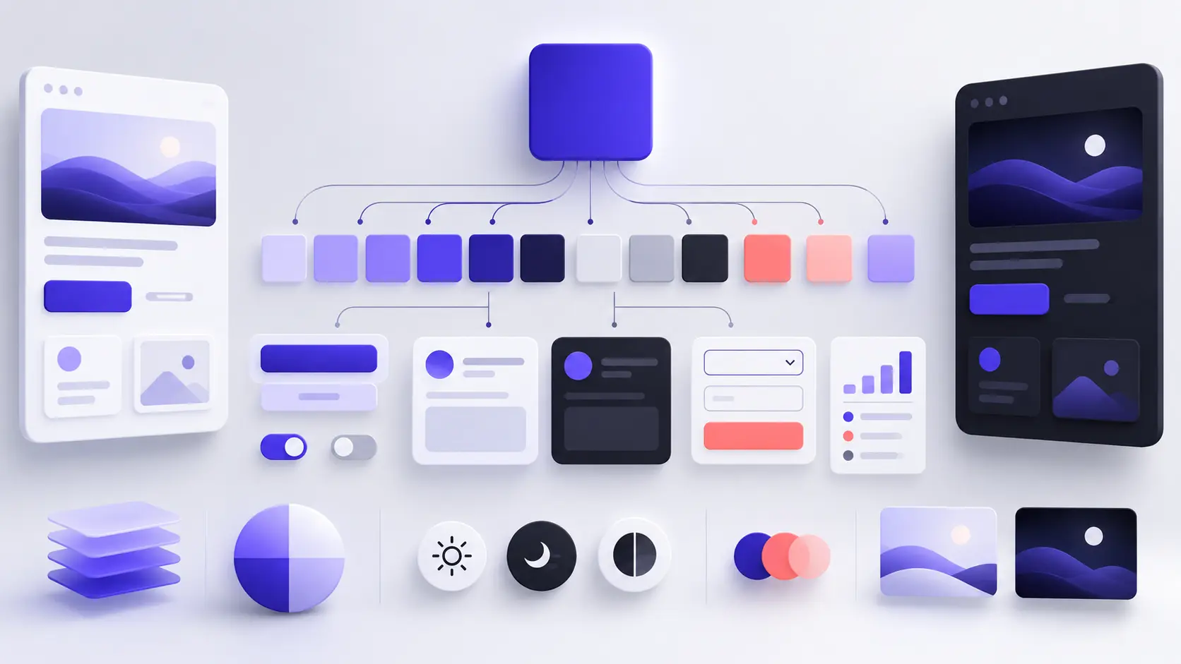
Turn One Color Into a Complete UI Palette
Start with one favorite color and build a practical interface palette in 12 steps, including roles, neutrals, contrast, states, dark mode and testing.
A favorite color can start a design, but it cannot complete one by itself. A usable interface also needs backgrounds, surfaces, readable text, borders, interaction states, feedback colors and accessible contrast. This practical workflow shows you how to turn a single color into a complete UI system with the help of a color palette generator.
Why a Good-Looking Palette Is Not Automatically a Good UI Palette
Palette generators are excellent for exploration. They can quickly show combinations that would take much longer to discover manually. However, five attractive swatches do not automatically become five usable interface colors. A design system needs hierarchy and purpose. You must know which color belongs to the page background, which one represents an action, which one carries text and which one communicates a warning.
The free Mr.Gena Color Palette Generator creates five-color combinations, lets you lock the colors you want to keep and allows you to adjust brightness, saturation and warmth. Those features make it useful for discovery, but the designer still has to turn the generated colors into a structured system.
If your immediate goal is brand identity rather than interface design, read our earlier guide on how to create a brand color palette. You may also want to review how to build a strong online personal brand before deciding what your colors should communicate.
In this guide, we will begin with one favorite color and develop it into a practical palette for websites, dashboards, mobile applications and digital products. The goal is not to collect as many beautiful colors as possible. The goal is to create a small, predictable system that helps people understand and use an interface.
1. Define the Interface Before Choosing Colors
Begin with the product, not the color wheel. A portfolio, banking dashboard, recipe application and children’s learning platform may require completely different levels of energy, trust, restraint and visual contrast. Write down what you are designing, who will use it and what users need to accomplish.
Next, list the major components in the interface. These might include a navigation bar, cards, forms, buttons, notifications, pricing tables and a footer. This inventory reveals how many functional color roles you need. Most interfaces require fewer roles than inexperienced designers expect.
Create three descriptive goals for the visual character of the product. Examples include “calm, reliable and direct” or “creative, energetic and friendly.” These words become a filter for evaluating generated palettes. A color may be attractive on its own but still be wrong for the experience you are building.
At this stage, do not decide that blue always means trust or red always means urgency. Color associations depend on context, culture, surrounding colors and previous user experience. Define the product’s practical needs first, and then evaluate how color supports them.
2. Convert Your Favorite Color Into a Stable Base
Your starting point might be a color from a logo, photograph, physical
product or personal preference. Convert that color into a precise digital
value such as HEX, RGB or HSL. “Deep purple” is open to interpretation;
a value such as #4F46E5 can be reproduced consistently.
If you do not have a starting color, use the Random Color Generator to explore possibilities. Treat randomly generated colors as prompts rather than final decisions. Generate several options, save the promising ones and compare them against the three product qualities you defined in step one.
If your inspiration comes from a logo, photograph or mood board, upload the visual to the Palette From Image tool. It can help you identify dominant colors and copy their codes. Select a color that represents the project, but check that it still works outside the original image.
A color surrounded by warm photography can feel different when placed on a plain white interface. Test your candidate on both light and dark backgrounds. If it becomes muddy, overly bright or difficult to distinguish, adjust its lightness or saturation before declaring it your base color.
3. Give the Base Color a Clear Semantic Role
A base color needs a job. In many products, the primary color represents important actions such as submitting a form, starting a trial or saving a change. In other interfaces, the same color may be used mainly for links, selected navigation items or decorative branding.
Decide where users should expect to see the color. If it means “interactive,” avoid applying it to ordinary headings and decorative shapes. Users learn visual patterns quickly. When the same color sometimes means “click here” and sometimes means nothing, the interface becomes less predictable.
Separate brand recognition from interface behavior. A strong brand color does not need to cover the entire screen. It can remain memorable when used selectively on a primary button, logo detail, active tab and focus indicator. Restraint often makes the color more recognizable because every appearance carries meaning.
4. Generate Useful Tints and Shades
One color value is rarely enough. Buttons need hover and pressed states, selected areas may need a pale background, and dark mode may need a lighter version of the same hue. Create a scale ranging from very light tints to deep shades.
Use the Color Palette Generator to explore monochromatic combinations and adjust brightness and saturation. Lock the base color so it remains stable while you regenerate the surrounding colors. Do not keep a generated value simply because it appears in the palette. Keep it only if it performs a specific role.
You can also use the Color Mixer to create intermediate values between two HEX colors. Mixing the base color with a light surface color can suggest subtle selected backgrounds. Mixing it with a darker endpoint can help you explore hover and pressed states.
Avoid scales where neighboring colors are almost indistinguishable. Each retained step should create a visible difference in context. A compact, useful scale is better than a ten-color scale whose values perform no distinct function.
5. Build a Neutral Foundation
Most of a functional interface is usually neutral. Page backgrounds, surfaces, borders, body text, muted labels and disabled controls need colors that do not compete with the primary action. This is why a UI palette cannot consist only of bright brand colors.
Begin with a page background and a surface color. The surface should be distinguishable from the background without creating a patchwork effect. Next, add a strong text color, a softer secondary text color and a subtle border color.
Neutrals do not have to be perfectly gray. A small amount of the brand hue can make a system feel more unified. For example, a cool primary color may work well with slightly cool grays. Keep the tint subtle enough that the content remains comfortable to read.
Do not use reduced opacity as the only method for creating muted text or borders. Transparent colors change when placed on different backgrounds. When consistency matters, define explicit values and test them on every surface where they will appear.
6. Choose a Controlled Secondary Color
A secondary color can support charts, illustrations, promotional areas or selected categories. It should expand the visual language without competing with the primary action. If both primary and secondary colors appear equally strong and equally often, users may struggle to understand which element deserves attention.
Explore analogous combinations when you want a calm relationship. Complementary or split-complementary combinations can create stronger separation, but they require more restraint. Adobe’s color theory guide provides a useful overview of the color wheel and common harmony models.
Choose the secondary color by testing it in a component rather than comparing isolated swatches. Place it in a small chart, tag, illustration or informational card. Then view it beside the primary button. If the secondary element attracts attention first, reduce its saturation, lighten it or limit how often it appears.
7. Assign Colors to Interface Roles
This is the point where a collection of colors becomes a design system. Replace color-based names such as “blue,” “purple” and “gray two” with role-based names. Semantic names allow the values to change later without forcing you to rename every component.
| Color role | Purpose | Typical use |
|---|---|---|
background |
Lowest page layer | Body and application canvas |
surface |
Raised content area | Cards, menus and dialogs |
text-primary |
Main readable content | Headings and body copy |
text-muted |
Lower-emphasis information | Hints, metadata and timestamps |
primary |
Main interactive emphasis | Buttons, links and active controls |
on-primary |
Content placed over primary | Button labels and icons |
border |
Separates related regions | Inputs, cards and dividers |
success |
Positive outcome | Confirmation and completion |
warning |
Potential risk | Cautions and pending states |
error |
Failure or required correction | Invalid fields and failed actions |
Keep the role list short at first. Add another token only when a recurring design problem cannot be solved by an existing role. This prevents dozens of nearly identical values from entering the interface.
8. Create Hover, Focus and Disabled States
Interfaces respond to people. A button may be idle, hovered, focused, pressed, loading or disabled. If all these states look identical, users receive little confirmation that the interface has noticed their action.
Create state colors as controlled variations of the component’s default color. A hover state might be slightly darker or lighter, while a pressed state can create stronger visual change. The focus indicator must remain visible against both the component and its surrounding background.
Do not communicate state through color alone. Combine color with another cue, such as an icon, underline, outline, message or change in shape. An invalid form field, for example, can use an error-colored border together with an error icon and explanatory text.
Disabled controls deserve particular care. They should look unavailable without becoming unreadable. Excessively pale text can create an accessibility problem, while a disabled button that looks active can create confusion. Test the complete component rather than judging only its fill color.
9. Test Color Contrast and Accessibility
Visual harmony does not guarantee readable content. Every important foreground and background pair must be tested for contrast. The W3C Web Content Accessibility Guidelines 2.2 specify a minimum contrast ratio of 4.5:1 for normal text and 3:1 for large text under Success Criterion 1.4.3.
| Combination to test | Why it matters |
|---|---|
| Body text on page background | Affects nearly every reading task |
| Muted text on surface | Frequently fails when made too pale |
| Button label on primary color | Must remain readable in every state |
| Links inside body content | Need to be identifiable and readable |
| Form borders and focus indicators | Help users locate interactive controls |
| Error text and validation icons | Carry information needed to complete a task |
Accessibility testing should happen during palette creation, not after an entire interface has been built. When a pair fails, adjust lightness before making random changes to the hue. Retest hover, pressed, selected and disabled versions individually because each state creates a different foreground-background relationship.
10. Prepare Light and Dark Mode Palettes
Dark mode is not created by reversing black and white. Colors behave differently on dark surfaces: bright saturated colors may vibrate, shadows become less useful and pure white text can feel harsh. Rebuild the hierarchy while preserving the meaning of each semantic role.
Keep token names consistent across themes. The value assigned to
background can change, but its purpose remains the same. The
same principle applies to surfaces, text, borders and primary actions. This
lets components switch themes without containing theme-specific logic.
Apple’s Human Interface Guidelines for color recommend considering different appearances and using color consistently for communication. Test both themes in context and make sure important information is not expressed by color alone.
Review screens in bright and dim environments when possible. A dark palette that looks elegant in a dark room may lack separation in daylight. Also inspect images, charts, illustrations and logos; these assets may require theme-aware versions rather than a simple background change.
11. Test the Palette Inside Real Components
A palette should not be approved as a row of swatches. Build a small test page containing a heading, paragraph, link, primary button, secondary button, form field, card, navigation item and alert. This reveals problems that remain invisible in a palette preview.
Test content of different lengths. A short English label may fit comfortably while the translated version wraps onto two lines. Check the palette at mobile and desktop sizes, with keyboard focus visible and with realistic error messages displayed.
Content-heavy layouts are especially useful for testing restraint. For example, the Free Resume Builder represents a type of interface where hierarchy and readability matter more than decoration. Ask whether your palette helps users scan sections or distracts from the information.
Remove colors that do not solve a real problem. If two values are visually interchangeable, keep one. If a secondary color repeatedly competes with the main action, reserve it for illustrations or remove it from the interface palette entirely.
12. Document, Export and Maintain the System
Once the palette works in real components, document it. Record every color’s value, semantic name, permitted uses and important restrictions. Include tested text combinations and examples of how not to use the colors.
The Color Palette Generator allows you to copy CSS, which provides a useful starting point. Rename the exported variables according to their roles so developers do not have to remember what each HEX value means.
:root {
  --color-background: #ffffff;
  --color-surface: #f7f7fa;
  --color-text-primary: #17171c;
  --color-text-muted: #5f606b;
  --color-primary: #4f46e5;
  --color-on-primary: #ffffff;
  --color-border: #d9dae2;
  --color-success: #16794b;
  --color-warning: #9a6700;
  --color-error: #b42318;
}
If you create a visual palette board as a PNG, the PNG to PDF Converter can turn it into a convenient PDF for sharing or archiving. However, do not rely only on a visual document. Store the final tokens in the project’s design system or codebase so the values remain consistent.
Treat the palette as a maintained system. When a value changes, test every role and state that uses it. Record why the change was made and remove old values instead of allowing nearly identical replacements to accumulate.
Final UI Palette Checklist
- The product and audience were defined before selecting colors.
- The base color has one clear semantic purpose.
- Every retained tint or shade performs a specific role.
- Background, surface, text and border neutrals are included.
- The secondary color does not compete with the primary action.
- Colors use semantic names rather than appearance-based names.
- Hover, focus, pressed, selected and disabled states were tested.
- Important information is never communicated by color alone.
- Text and background combinations meet appropriate contrast targets.
- Light and dark modes preserve the same semantic hierarchy.
- The palette was tested in real components and translated layouts.
- Tokens, usage rules and restrictions were documented.
Final Thought: A Palette Becomes Valuable When Every Color Has a Job
Starting with one favorite color is completely reasonable. The mistake is expecting that color—or an automatically generated group of swatches—to solve every interface problem. A successful UI palette combines creative exploration with deliberate assignment, contrast testing and component-level validation.
Use a generator to discover possibilities, lock promising colors and create useful variations. Then reduce the results to a small semantic system. When every color has a defined job, your interface becomes easier to understand, easier to maintain and more consistent across pages, themes and devices.
Open the Color Palette Generator, enter your starting color and build your first five-color combination. Instead of asking only whether the colors look good together, ask the more valuable question: what specific job will each color perform?