

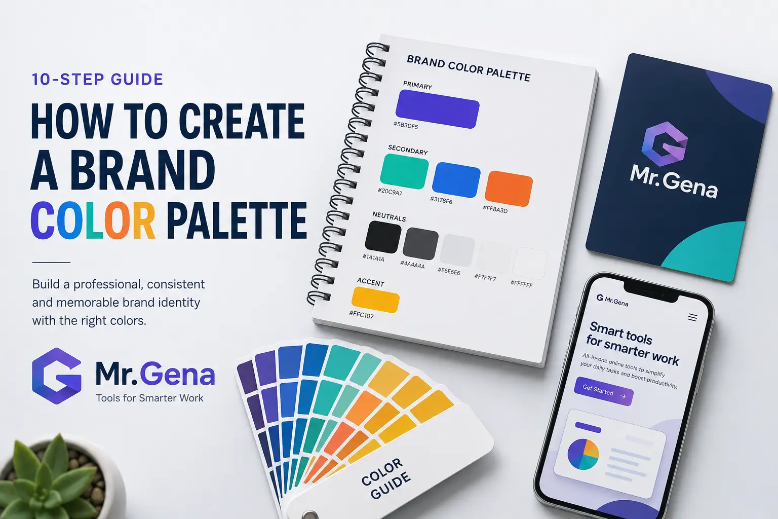
How to Create a Brand Color Palette in 2026: 10-Step Guide
Learn how to create a professional brand color palette in 10 practical steps, from choosing a primary color to testing contrast, combinations, and real-world use.
A strong brand color palette does much more than make a website or logo look attractive. Color influences how quickly people recognize a brand, how consistent a business appears across different channels, and whether important elements such as buttons, headings, labels, and calls to action are easy to understand. When colors are chosen randomly, even good design work can feel fragmented. When they are selected as part of a system, the same brand can remain recognizable across a website, social profile, presentation, advertisement, email, and printed material.
The challenge is that choosing brand colors is not simply a matter of picking three shades you personally like. You need to think about the personality of the brand, the audience, contrast, accessibility, visual hierarchy, competitors, and how the colors behave when they are used together. A palette that looks impressive in a small mood board may become difficult to use when you need backgrounds, buttons, text, cards, charts, and promotional graphics. This guide explains a practical ten-step process for building a brand color palette that is both visually distinctive and useful in real-world design.
- Define the personality your colors should communicate
- Study the visual language of your market
- Choose one strong primary brand color
- Build supporting colors around the primary shade
- Extract useful colors from visual references
- Create smoother combinations and intermediate shades
- Test contrast and readability
- Assign a specific role to every color
- Test the palette in real design situations
- Document the palette as a reusable brand system
1. Define the Personality Your Colors Should Communicate
Before selecting any specific color, define what the brand is supposed to feel like. A financial platform may want to communicate stability, control, and trust, while a children's entertainment brand may prioritize energy, friendliness, and playfulness. A premium beauty company might want a restrained, elegant appearance, whereas a gaming brand may deliberately use stronger contrast and more saturated colors. The palette should support the character of the business instead of being chosen independently from it.
Try describing the brand with four or five clear adjectives. Words such as calm, technical, bold, premium, natural, youthful, minimalist, energetic, or approachable can create a useful direction. The goal is not to claim that one color always means one emotion. Cultural expectations, context, shade, saturation, and neighboring colors all influence perception. Instead, use the personality words as a filter. If a color combination feels inconsistent with the intended personality, it probably does not belong in the final system.
This is also a good stage to clarify the brand name and identity direction if those decisions are still unfinished. A brand called something playful may need a very different visual system from one positioned as a serious professional service. When naming is still part of the project, a Name Generator can help you explore different naming styles before locking the visual identity around a final concept.
Start with meaning, not decoration: your palette should answer a communication problem. Ask what the audience should feel and understand when they encounter the brand before deciding which shades look attractive.
2. Study the Visual Language of Your Market
Competitor research does not mean copying another company's colors. Its purpose is to understand the visual expectations that already exist in your category. If nearly every company in an industry uses similar blue and gray combinations, that may indicate that the market associates those colors with trust and professionalism. It may also reveal an opportunity to stand out with a different but still credible direction. Both conclusions can be useful.
Create a simple visual sample of brands that compete for the same audience. Record their dominant colors, accent colors, background choices, and overall saturation level. Then look for repeated patterns. You may discover that most direct competitors are conservative while newer challengers use brighter colors, or that almost everyone relies on one dominant hue with a neutral supporting system.
The objective is to find a position between familiarity and distinction. A brand that looks completely unrelated to its market can confuse people, but a brand that looks almost identical to every competitor becomes difficult to remember. Color should provide enough familiarity for users to understand the category while still creating a recognizable identity of its own.
| What to Review | What You Are Looking For | Why It Matters |
|---|---|---|
| Primary colors | Frequently repeated hues in the category | Shows common market expectations |
| Accent colors | How competitors create attention | Helps you differentiate calls to action |
| Backgrounds | Light, dark, neutral, or colorful layouts | Affects the overall feel of the brand |
| Saturation | Muted versus vivid visual systems | Reveals how aggressive or restrained the market appears |
3. Choose One Strong Primary Brand Color
The primary color is the visual anchor of the brand. It may appear in the logo, major headings, important interface elements, branded graphics, and other high-recognition areas. Because it carries so much responsibility, it should work in more than one context. A color that looks excellent in a logo but becomes exhausting across a full website can create problems later.
Start by exploring a range of hues rather than immediately committing to one exact HEX value. Compare warmer and cooler versions, muted and saturated options, and slightly lighter or darker variations. If you do not yet have a clear direction, a Random Color Generator can be useful for discovery because it can expose you to combinations and hues you may not have considered manually. Random exploration is especially helpful at the beginning, when the goal is generating possibilities rather than making the final decision.
Once a promising hue appears, test it on both white and dark backgrounds. Look at it at large scale and as a small interface element. Check whether it still feels distinctive when used as a button, icon, underline, tag, or small logo detail. Many colors behave very differently when the surface area changes.
- Test the primary color on light and dark backgrounds.
- View it at both large and small sizes.
- Check whether it remains recognizable when slightly desaturated.
- Compare it with direct competitors.
- Make sure it supports the personality defined in step one.
4. Build Supporting Colors Around the Primary Shade
A complete brand palette needs more than one memorable color. Supporting colors make it possible to create hierarchy, variation, states, sections, charts, backgrounds, and secondary actions without forcing the primary shade into every element. The key is to choose colors that have clear jobs rather than building a large collection of shades that all compete for attention.
A practical palette often includes one primary color, one or two secondary colors, an accent color, and a neutral system. Neutral colors are particularly important because most digital interfaces contain far more text, whitespace, borders, backgrounds, and containers than highly saturated brand elements. If the neutral system is weak, the design can feel inconsistent even when the main brand color is strong.
The Color Palette Generator can help create and compare multi-color combinations while adjusting characteristics such as brightness and saturation. This is useful when you already know the general direction but want to see whether several shades can coexist as one system. The goal is not to find five equally dominant colors. It is to find a group in which one shade leads and the others support it.
Avoid equal competition: if every color is equally bright, saturated, and visually strong, the viewer has no clear hierarchy. A good palette usually contains dominant, supporting, and neutral roles.
5. Extract Useful Colors From Visual References
Sometimes the best palette direction begins with an image rather than a color wheel. A photograph, product shot, architectural interior, landscape, packaging example, or mood-board image can contain combinations that already feel naturally balanced. These references are especially useful when the brand has a strong visual theme, such as nature, travel, hospitality, food, fashion, or lifestyle.
Instead of manually guessing the HEX values from an image, you can use Palette From Image to identify dominant colors from an uploaded image or image URL. Once those colors are extracted, treat them as raw material rather than an automatic final palette. A photo may contain ten attractive shades, but the brand probably needs only a few of them.
Look for relationships within the image. Perhaps there is one strong dominant color, a softer supporting hue, a dark neutral, and a pale background. That structure can translate naturally into a digital design system. It is often more useful to preserve the relationship between the colors than to copy every exact shade from the source.
A visual reference can reveal combinations that already work together, but the extracted colors should still be adjusted for contrast, readability, and brand consistency before they become official brand colors.
6. Create Smoother Combinations and Intermediate Shades
Even when two colors work individually, the transition between them may feel too harsh. This becomes noticeable in gradients, charts, illustrations, data visualizations, background transitions, and interface states. Creating intermediate shades can make the visual system feel more intentional and can give designers more flexibility without introducing unrelated colors.
A Color Mixer can help explore what happens between two HEX values and generate intermediate steps. This is particularly useful when building a family of shades around the main brand color or when you need smoother transitions between a primary and secondary hue. Instead of manually choosing several nearly identical colors, you can create a more systematic progression.
However, avoid creating so many shades that the brand guide becomes difficult to use. A design system does not need fifteen variations of the same blue unless the product is complex enough to require them. For most brands, a small number of well-defined variations is easier to manage than a huge library of nearly identical options.
| Shade Type | Typical Use |
|---|---|
| Primary | Logo details, important buttons, key highlights |
| Dark variation | Hover states, headings, strong contrast elements |
| Light variation | Backgrounds, badges, subtle sections |
| Secondary | Supporting graphics and alternate actions |
| Accent | Small areas that require additional attention |
7. Test Contrast and Readability
A visually attractive palette can still fail if text becomes difficult to read. Contrast is one of the most practical parts of color selection because it directly affects usability. Light gray text on a white background may look elegant in a design mockup but become uncomfortable to read on a smaller screen. Similarly, a bright brand color may work well as a background but fail when white text is placed on top of it.
Test every important text-background combination rather than assuming that one palette automatically works everywhere. Pay particular attention to buttons, navigation, form labels, small text, error messages, and any element that contains essential information. Decorative colors have more freedom, but functional elements need stronger clarity.
Do not rely only on how a combination looks on your own monitor. Different screens, brightness settings, and environmental conditions can change the viewing experience. A design that appears perfectly readable in a controlled office environment may become difficult outdoors or on a low-quality display.
- Test body text first. Long reading areas require comfortable contrast.
- Check button labels. Important actions should remain immediately readable.
- Review small interface text. Captions and labels often reveal contrast problems first.
- Try both desktop and mobile. Small screens can make weak combinations more obvious.
- Check light and dark variations. Do not assume the same pair works in every interface state.
8. Assign a Specific Role to Every Color
A color palette becomes a brand system only when each color has a purpose. Without predefined roles, designers and marketers may use different shades for the same function, creating inconsistency over time. One person may use teal for primary buttons while another uses blue, and a third may introduce a new green because it “looks better” in one campaign. After enough small decisions, the brand begins to fragment.
Define where each color should normally appear. The primary color might be reserved for the most important actions and recognizable brand elements. A secondary color could support illustrations and section highlights. The accent color might be used sparingly for promotions or status indicators. Neutrals should cover backgrounds, text, borders, and inactive elements.
Role assignment also reduces design decision fatigue. When someone creates a new landing page, social graphic, or presentation, they do not need to reconsider the palette from the beginning. The system already provides a reasonable answer for most situations.
| Color Role | Typical Purpose | Frequency |
|---|---|---|
| Primary | Main identity and high-priority actions | Frequent but controlled |
| Secondary | Supporting graphics and alternate emphasis | Moderate |
| Accent | Promotions, highlights, special attention | Limited |
| Dark neutral | Headings and body text | Very frequent |
| Light neutral | Backgrounds, cards, borders | Very frequent |
9. Test the Palette in Real Design Situations
A palette should never be approved based only on five rectangles displayed next to each other. Colors need context. Put them into a realistic homepage header, mobile screen, advertisement, presentation slide, social media post, email banner, and simple printed document. These tests reveal practical problems much faster than a theoretical palette preview.
You may discover that the accent color attracts too much attention, the secondary color is too close to the primary shade, or the neutral background makes the entire brand look colder than expected. Testing also helps determine how much of each color should be visible. A very bright accent may work beautifully when it occupies five percent of a layout but become overwhelming at thirty percent.
If Instagram is part of the brand's marketing mix, identity consistency should also extend to the account name and profile presentation. When developing a new social identity, the Instagram Username Generator can help explore username formats that remain aligned with the brand name and are easier to carry consistently across campaigns. The visual palette and account identity should support one another rather than feeling like separate projects.
Do not approve colors in isolation. A palette can look excellent on a mood board and still perform poorly when placed into buttons, forms, navigation, long-form content, and social graphics.
10. Document the Palette as a Reusable Brand System
Once the colors have been tested, record the final values and usage rules. At minimum, document the HEX values used for digital work. Depending on the team's workflow, RGB, HSL, CMYK, or other formats may also be useful. The objective is to prevent future team members from approximating the colors by eye or creating slightly different versions.
The brand guide does not need to be a hundred-page document. A simple page showing the primary, secondary, accent, and neutral colors with their values and intended roles can prevent a surprising number of inconsistencies. Include examples of approved combinations and, when necessary, combinations that should not be used.
It is also useful to document proportions. For example, neutral colors may occupy the majority of most layouts, the primary brand color could appear in important sections, and the accent may be limited to small highlights. These rules do not need to be mathematically strict, but they give designers a consistent starting point.
- Record the exact HEX values of every approved color.
- Define which color is primary, secondary, accent, and neutral.
- Show approved text and background combinations.
- Document common button, link, and interface states.
- Include examples of real layouts using the palette.
- Update the guide whenever an official brand color changes.
Common Brand Color Mistakes to Avoid
One of the most frequent mistakes is choosing too many colors because each one looks attractive individually. Every additional color creates another decision that designers need to make later. Unless the brand has a specific reason for a broad spectrum, a smaller system is usually easier to maintain. A focused palette also makes recognition stronger because the same combinations appear repeatedly.
Another mistake is allowing trend research to dominate the identity. Color trends can be useful inspiration, but a brand may need to remain recognizable for many years. A palette that looks fashionable for six months but feels dated immediately afterward can create unnecessary redesign work. Trends should influence details more than the entire strategic foundation.
Accessibility problems are equally important. Designers sometimes choose extremely pale text, low-contrast buttons, or decorative combinations that make information difficult to understand. The most visually interesting option is not automatically the most effective option. A professional brand identity needs to work for the people using it, not only look impressive in a portfolio presentation.
Too Many Colors
A large palette creates inconsistent decisions and weakens recognition. Start smaller and expand only when there is a real need.
No Defined Roles
Even good colors become inconsistent when everyone uses them differently. Assign a clear purpose to each shade.
Ignoring Contrast
A beautiful color combination is not successful if important text or buttons become difficult to read.
Designing Only for the Logo
The palette must work across websites, interfaces, social content, presentations, and other everyday applications.
How Many Colors Should a Brand Palette Have?
There is no universal number, but most brands benefit from keeping the core system relatively compact. A practical starting point might include one primary brand color, one or two supporting colors, one accent color, and several neutrals. The neutral system can contain multiple shades because text, borders, backgrounds, disabled states, and cards often require different levels of contrast.
What matters more than the exact number is whether every color has a reason to exist. If two shades perform almost exactly the same function and look very similar, one may be unnecessary. If the team repeatedly invents new colors because the existing palette cannot support common interface states, the system may need to expand.
Think of the palette as a toolkit rather than a collection. A good toolkit contains enough options to solve recurring design problems without becoming so large that nobody remembers which option should be used. Simplicity is valuable because it makes consistency easier across teams, agencies, freelancers, and future campaigns.
What is the best number of colors for a brand palette?
There is no fixed number, but many brands work well with one primary color, one or two supporting colors, an accent color, and a neutral system. Each color should have a clear purpose.
Should a logo use every brand color?
No. A logo can use only the primary color or a limited subset of the palette. The broader system is meant to support many other brand applications.
Can a brand use both warm and cool colors?
Yes. Warm and cool colors can work together when their roles, saturation, and contrast are carefully controlled. The combination should still feel intentional rather than random.
How often should brand colors be changed?
Brand colors should not be changed simply because a new trend appears. Updates make more sense when the positioning, audience, product, or overall identity has changed significantly.
Do website colors need to match the logo exactly?
The website should clearly belong to the same visual system, but it may use additional neutrals, lighter shades, and supporting colors that do not appear directly in the logo.
What is the most important color in a brand palette?
The primary color usually carries the strongest recognition, but the supporting and neutral colors are equally important for creating a usable and consistent design system.
A useful brand color palette is not simply a selection of attractive shades. It is a small visual system in which every color supports a specific purpose, works across different environments, and helps the brand remain recognizable over time. The strongest palettes balance personality with usability: they feel distinctive enough to be remembered while remaining flexible enough to support everyday design work.
Before approving a palette, move beyond the color swatches and test it in the places where customers will actually encounter the brand. Build a sample page, create a social graphic, design a button, prepare a presentation slide, and view the colors on different screens. When the same system continues to feel clear and consistent across all of those situations, you are no longer choosing colors—you are building a visual identity that can scale with the brand.