

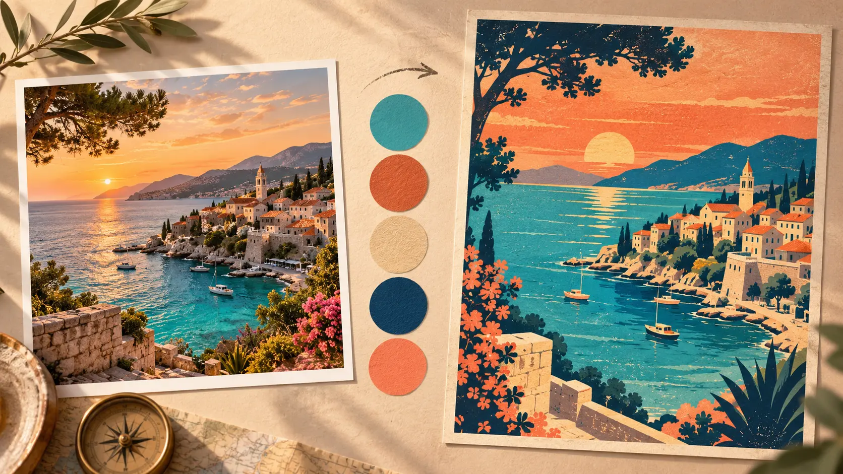
Create a Travel Poster Palette From One Photo
Turn one vacation photo into a focused travel-poster palette. Learn how to extract dominant colors, assign visual roles and build a clear printable design.
PHOTO-TO-DESIGN EXERCISE
A memorable vacation photograph contains more than scenery. It also holds a collection of colors connected to the atmosphere of the destination. With the right workflow, those colors can become the foundation of a distinctive travel poster rather than remaining hidden inside the image.
From a Personal Memory to a Repeatable Visual System
Vacation photographs are often emotionally powerful but visually complicated. A single image may contain thousands of colors created by sunlight, shadow, reflections, vegetation, buildings, clothing and camera processing. Trying to use all those colors in a poster would create noise rather than atmosphere.
The purpose of palette extraction is not to reproduce every pixel. It is to reduce the photograph to a small collection of representative colors that preserves its character. Those colors can then be assigned to backgrounds, typography, illustrations and accent details.
The free Mr.Gena Palette From Image tool allows you to upload a PNG, JPG or WebP file, choose how many colors you want to extract and copy the results as CSS. Processing happens directly in the browser, making it convenient for quickly exploring personal travel photographs.
This exercise continues the creative process covered in our guide about turning a random color into a complete design direction. The difference is that the starting colors now come from a meaningful photograph rather than a random result.
By the end of this tutorial, you will have a reduced palette, a poster concept, a typography plan, a set of color roles and a final checklist for preparing the design for digital sharing or print.
1. Define the Destination Story
Start with the memory you want the poster to communicate. A destination is not a story by itself. Paris could represent architecture, cafés, fashion, night streets or a quiet morning beside the Seine. Istanbul might be presented through ferries, historical streets, food, skylines or movement between two continents.
Write one sentence describing the intended impression. For example: “Create a warm, nostalgic poster that remembers an August evening on the Mediterranean coast.” This sentence will help you decide which colors, shapes and details deserve emphasis.
Record the destination, season and approximate date. If you want to include the duration of the journey as a small poster detail, the Days Between Dates Calculator can calculate the exact number of days between the beginning and end of your trip.
Finish this step by choosing three descriptive words. “Warm, relaxed and sun-faded” creates a more useful design filter than simply writing “summer vacation.” Every later decision should support those words.
2. Choose a Photograph With Usable Color Information
The most beautiful photograph is not always the best palette source. A dramatic image may contain one dominant dark area and very little variation. Another photograph may contain so many competing objects that the extracted palette feels disconnected.
Review several photographs from the trip and look for an image with a clear focal point, visible lighting direction and a limited group of recognizable colors. Landscapes, architectural details, market scenes, beaches and transportation photographs often produce interesting results.
| Photo characteristic | Why it helps | Potential risk |
|---|---|---|
| Clear focal point | Provides an obvious poster subject | The subject may be too small after cropping |
| Distinct lighting | Creates atmosphere and color relationships | Strong filters may produce unnatural colors |
| Limited visual clutter | Makes dominant colors easier to identify | The result may become too visually simple |
| Visible foreground and background | Supports depth and layered composition | Too many layers can weaken the hierarchy |
| Recognizable local detail | Connects the poster to the destination | A generic detail may not identify the place |
Use a photograph you created or have permission to use. A palette may be extracted for study, but publishing the complete poster may involve the rights connected to the original image, recognizable people, private property or protected artwork.
3. Prepare the Image Before Extracting Colors
Palette extraction reflects the file you upload. If the photograph is too dark, strongly filtered or dominated by an irrelevant object near the edge, the extracted colors will reflect those problems.
Create a duplicate so the original remains untouched. Crop unnecessary areas and make restrained adjustments to exposure, white balance and contrast. The objective is not to create an exaggerated social media filter. It is to make the important color relationships easier to identify.
Consider preparing two crops. The first can show the full scene, while the second focuses tightly on the most meaningful area. Extract a palette from both versions and compare the results. A smaller crop often reveals more specific colors that were overwhelmed by a large sky or dark foreground.
4. Extract the Dominant Color Palette
Upload the prepared image to Palette From Image or paste a direct image URL. Begin with five colors. This is usually enough to reveal the main visual relationships without producing an overwhelming collection.
Review the generated swatches beside the photograph. Ask where each color appears. One may represent the sky, another the architecture, another deep shadows and another a small but memorable object.
Generate another version with a different number of colors. A three-color result can expose the image’s simplest identity, while seven or eight colors may reveal useful accents. Do not assume that the largest palette is the most accurate or valuable.
If you want to verify a specific point manually, Adobe’s official Photoshop Eyedropper guide explains how a color can be sampled from an image and added to the Swatches panel.
Designers using free desktop software can consult the official GIMP Color Picker documentation. GIMP also provides a sample-average option, which can help avoid selecting an unrepresentative value from one unusual pixel.
5. Separate Dominant Colors From Useful Colors
An extraction tool identifies representative colors, but it does not know the communication goal of your poster. The most common color in a photograph may be a gray road, pale sky or dark shadow. That makes it dominant, but not necessarily suitable as the main identity color.
Evaluate each swatch using three questions: How much of the photograph does it represent? How strongly is it connected to the destination? What job could it perform in the poster?
A small red umbrella might occupy only one percent of the photograph but become the perfect poster accent. Meanwhile, a large concrete wall may produce the dominant gray but serve only as a neutral background.
For historical inspiration, explore the Library of Congress guide to travel posters. Its collection demonstrates how travel posters use color, landmarks, activities and transportation to communicate a destination quickly rather than documenting every visible detail.
| Extracted color type | Possible poster role | Decision test |
|---|---|---|
| Light sky or wall color | Background | Can text remain readable over it? |
| Dark shadow or structure | Headline or silhouette | Does it provide sufficient visual contrast? |
| Landscape mid-tone | Main illustration area | Does it represent the destination? |
| Bright local detail | Accent | Does it attract attention without dominating? |
| Muted supporting color | Secondary shape or caption | Does it support hierarchy rather than add noise? |
6. Reduce the Result to a Focused Poster Palette
Choose three to five colors from the extracted results. A useful travel poster palette might contain one light background, one dark foreground, one destination color and one bright accent. A fifth color can support depth or secondary information.
Remove colors that are nearly identical. Two pale beige values may appear different in the extraction results but perform the same job in the final design. Keeping both creates extra decisions without adding useful range.
Do not force every extracted swatch into the poster simply because it came from the photograph. Extraction provides evidence, not an obligation. The final palette should preserve the image’s atmosphere while remaining simple enough for a viewer to understand immediately.
Place the selected colors in a horizontal row from lightest to darkest. Then arrange them by importance. These two views reveal different information: tonal range and visual priority.
7. Assign Every Color a Clear Role
Name colors according to their purpose rather than their appearance. “Mediterranean blue” may sound attractive, but “poster background” tells you how the color should be used. Role-based names also make later revisions easier.
A basic poster system could include background, headline, illustration primary, illustration secondary and accent. Test every foreground color against the background before committing to detailed composition.
Our previous guide on turning one color into a complete interface palette explains role-based color systems in greater detail. Although a poster is not an interface, the same principle applies: every retained color should have a predictable responsibility.
:root {
  --poster-background: #f2d4a7;
  --poster-headline: #19384a;
  --poster-landscape: #4f8074;
  --poster-shadow: #31505a;
  --poster-accent: #d95d45;
}
The example values above are illustrative. Use the actual codes extracted from your photograph and test them in the final poster context.
8. Transform the Photograph Into Graphic Shapes
A travel poster does not need to reproduce the photograph realistically. Identify the large shapes that make the destination recognizable: the curve of a coastline, silhouette of a mountain, roofline of a historic building, outline of a ferry or repeated arches in a street.
Reduce the image to foreground, middle ground and background. Assign one or two palette colors to each level. Small photographic details can disappear as long as the destination and intended mood remain understandable.
Use contrast to guide attention. A dark silhouette against a pale sky creates immediate clarity. A bright accent can identify a sun, umbrella, vehicle, window or small architectural feature.
Avoid tracing every object. Detailed tracing often produces a complicated illustration that loses the directness associated with classic poster design. Simplification should reveal the visual idea, not merely reduce the file size.
9. Build a Strong Poster Hierarchy
Decide what the viewer should notice first, second and third. In many travel posters, the destination name is the primary text, the illustration carries the atmosphere and a smaller line provides a date, region or invitation.
Use scale before adding more colors. A large headline, clear focal shape and generous empty space can create stronger hierarchy than multiple outlines, shadows and decorative labels.
Position the headline where the photograph already provides visual space. A calm sky may accommodate large typography, while a detailed city scene may require a solid text panel. Do not place text over the busiest part of the image simply because that area is centrally located.
| Hierarchy level | Poster element | Design method |
|---|---|---|
| Primary | Destination or main visual | Largest scale and strongest contrast |
| Secondary | Supporting scene or tagline | Moderate scale and controlled placement |
| Tertiary | Date, region or trip detail | Smaller type with readable spacing |
| Accent | One memorable visual detail | Limited use of the brightest color |
10. Write Short and Effective Poster Copy
A poster must communicate quickly. Begin with the destination name and one supporting line. The supporting line could identify the region, season, travel theme or personal memory.
Use the Word Counter to compare different versions. If the supporting line requires several sentences to explain, it probably belongs in a caption accompanying the poster rather than inside the design.
Keep wording specific. “Discover Adventure” could describe almost any destination. “Evening Ferries Across the Bosphorus” gives the viewer a place, activity and time of day.
Before final export, check the destination name, punctuation and supporting copy with the Grammar Checker. Review every suggestion manually, especially when the poster includes local place names or intentionally shortened phrases.
11. Test the Poster in Realistic Situations
Test the design as a phone-sized social post, desktop image and printed page. Details that appear clear on a large design canvas may disappear when the poster is viewed in a feed or printed on an ordinary home printer.
Check the headline from a distance, inspect text contrast and confirm that the accent color still guides attention. Print a low-cost draft before ordering a large professional copy. Screen brightness can make colors look more vivid than they appear on paper.
If the poster includes a QR code leading to a travel gallery or trip story, use the QR Code Reader to test the code from an exported image. Repeat the test after printing, because texture, scale, glare and low contrast can affect scanning.
Show the poster to someone who did not join the trip. Ask which destination or atmosphere they recognize before explaining the original photograph. Their first impression will reveal whether the design communicates outside your personal memory.
12. Export and Document the Finished Design
Export separate versions for digital and print use. A social media image, website thumbnail and printable poster should not automatically use the same dimensions or compression settings.
Open every exported version and inspect the edges, text, image quality and colors. Check that no important detail was cropped and that the poster remains readable at its intended size.
If the print-ready PDF becomes too large to share, use the Compress PDF tool to create a smaller copy. Keep the original high-quality export separately, because strong compression may not be suitable for professional printing.
Save a short design record containing the original photograph, extracted palette, selected HEX values, typography choices, poster dimensions and export date. This documentation makes it easier to create a related postcard, social post or second poster without rebuilding the visual system.
Final Travel Poster Palette Checklist
- The poster communicates one clear destination story.
- The source photograph is owned or appropriately licensed.
- The photograph has a recognizable focal point and useful color range.
- A duplicate image was prepared without damaging the original.
- Palettes with different color counts were compared.
- Dominant colors were separated from strategically useful colors.
- The final palette contains only three to five necessary colors.
- Every selected color has a defined poster role.
- The photograph was simplified into recognizable graphic shapes.
- The destination, illustration and supporting copy have clear hierarchy.
- The poster was tested at thumbnail, screen and print sizes.
- The final files and color values were documented.
The Best Palette May Already Be Inside Your Camera Roll
You do not always need to search through hundreds of unrelated palettes to find a meaningful visual direction. A photograph from a journey already contains colors connected to a place, season, light and personal experience. Extracting those colors gives the poster an authentic starting point.
The extraction result is not the finished design. You still need to choose which colors deserve attention, remove unnecessary similarities, assign roles and test the palette with typography and graphic shapes. That editing process is what turns photographic data into design.
Open Palette From Image, select one vacation photograph and begin with five extracted colors. Reduce the result until every remaining swatch helps communicate the destination. Your final poster should not contain every detail from the trip—it should preserve the part of the memory that deserves to be seen first.